This post is part of a series on menu development, which examines strategies for building a menu that reflects your brand and engages customers. (Photo: courtesy of Toby’s Estate.)
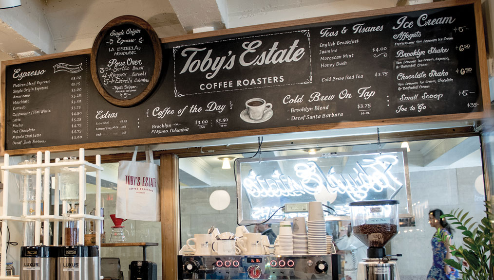
[A]t Toby’s Estate, the menu is a strong design element reflecting the unique personality of each of their four New York cafés. While each menu follows a basic template—standard espresso offerings, single-origin selections, seasonal drinks, teas—customers will have a slightly different experience at each location. “Single-origins vary by location just depending on what’s available and what’s exciting. It’s going to come down to the preferences of guests—we want to have something for everybody,” says Allie Caran, a coffee educator at Toby’s Estate.
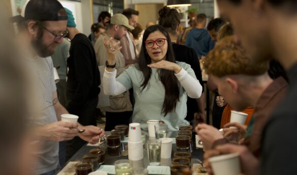
Caran explains that the menu is merely a tool to present what’s available, but it’s the staff they really depend on to engage the customer and provide education about the coffee. “Our menu’s great, but it wouldn’t be anything without our staff,” she says. Caran describes the menu at Toby’s Estate as a living document, something they view as ever-changing. The staff at Toby’s participate in trainings at least two times a month, and the menu lays a foundation for what’s covered. She says, “The way we explain coffee, the way we talk about it—for us [the menu has] become its own catalyst for brewing better coffee and creating better specs.”
At their Flatiron location, white marble and a menu written on a mirror reflect the grandiose designs of Fifth Avenue. It’s elegant, but the enamel-painted menu requires any changes be made overnight. “We’ve gotten a lot better with our ability to change a board,” she says of their West Village and Vanderbilt locations. The Vanderbilt store features a long, narrow menu composed of panels, each of which can be removed individually when updates are required.
–Ellie Bradley is Fresh Cup’s associate editor.
More in this series:


