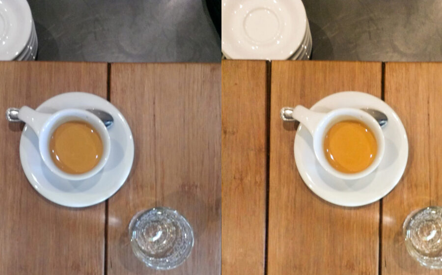
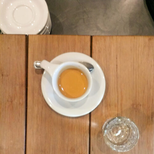
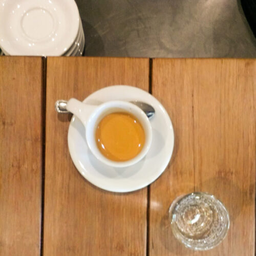
[E]very photo of a perfect rosetta or unctuously thick crema can be improved by a quick run through photo editing software. While slapping on an Instagram filter can make your photos pop, they’ll end up looking like all the thousands of other photos enhanced with the “Mayfair” or “toaster” filter. Your Instagram and Flickr portfolios will have that much more of your personal touch when you’ve edited the photos yourself. Most well-framed, well-lit photos (and we’re talking about cell phone photos here) just need one or two adjustments that take less time to apply than it takes the app to open.
(If you don’t have a photo-editing app on your phone, there are plenty of free programs that do a fine job. I recommend Photoshop Express and Snapseed, two robust and free apps.)
Boost the Contrast
Without a clear difference between dark and light surfaces, the master illusion of photography (that it’s 3D) fades and your eye becomes aware that you’re really looking at a 2D screen. With contrast, especially darker shadows, a photo feels like you could step into it.
Find the contrast tool in the adjustment menu in your app (the menu will include items like “exposure,” “tint,” “shadows,” etc.). Play with the contrast, blasting out the highlights and then overdoing the darks. Often you’ll end up making a small adjustment, otherwise the whites will blowout.
More than contrast, I find that adjusting the shadows (called “blacks” in some tools) does the trick. Most cell cameras capture decent highlights, which makes boosting the shadows a very effective way increasing contrast.
Here’s the difference between adjusting the contrast only and then and the shadows only.
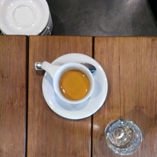
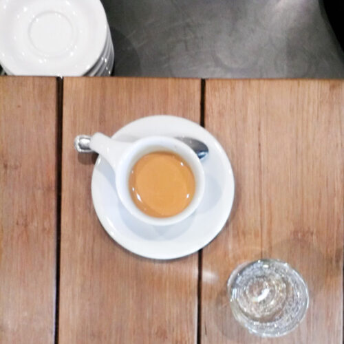
Find the Right Temperature
In photography, temperature refers to the length of the waves of light hitting the camera’s sensor. Back in film days, film designed for sunlight would turn your shot sickly yellow-orange under tungsten lights and puke blue-green under fluorescents. That was bad enough when taking a photo of a person. The wrong temperature can render foam a fungal-green. Even junky phone cameras are smart enough to adjust to a decent temperature, so this family-photo-ruining problem happens rarely. But I’ve found that cafés can fool the sensor, especially at the bar.
A shot of a white cup lit by a large window in the background and fluorescent lights behind the photographer can result in a beautiful background and a greenish cup, or a white cup and a Martian café. Even worse is when the sensor glitches and the whole thing goes purple or red. Usually the camera splits the difference, giving an oddly garish look.
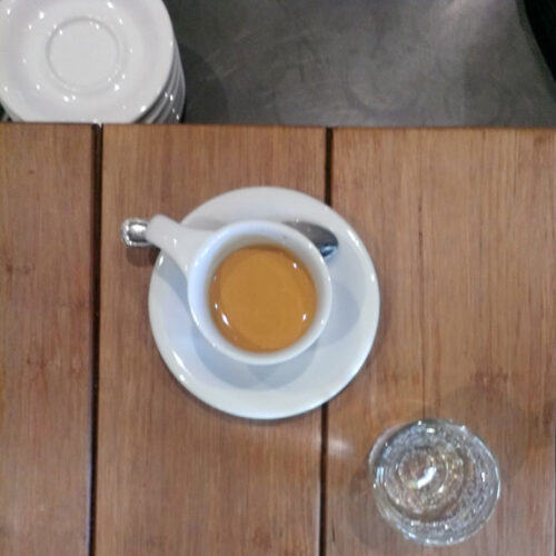
In your app, find the temperature tool (often called “warmth”) and slide up and down the scale. It’s a psychedelic bit of fun. Usually the adjustment will be small, but the result can be huge. For instance, in this photo I thought it was a little blue, giving it a harsh tone to what should be rich wood. So I made the photo “warmer.” Then I bumped up the contrast.
Playing with the temperature of your photos will also teach you a great deal about what light does to your photos and what spots in the café produce the best images.
Once you’ve played around with contrast and temperature, try other adjustments in the app. Some you’ll try once and forget while others will award you with fine control and a unique look. Without relying on a hackneyed filter for a “boost,” the result is a natural but striking image.
—Cory Eldridge is the editor of Fresh Cup.

