[W]hen the crew at Blueprint Coffee in St. Louis thought of how they would represent the flavor of the bagged coffees they sold, their first move was to get away from coffee. When you’re deep in an industry, articulate in its jargon and quick with its shorthand, it’s normal that you’ll talk about your product in ways that zoom over your customers’ heads. The six folks who own Blueprint (yeah, six) decided to study beer, cheese, and wine to help guide their approach. Wine, especially, provided a bevy of ways to represent flavor.
Among their first decisions, they chucked flavor descriptors, the most common tool used by roasteries. Working in a market still young in third-wave years, Blueprint wanted to avoid pretension, to not be off-putting as co-owner Mike Marquard says. They also wanted to avoid misunderstandings. The Midwest coffee culture Blueprint lives in is heavily populated by flavored beans. “We didn’t want people to think too literally about taste descriptors. I’ve had bad experiences with that in the past where people actually think there are macadamia nuts in the coffee,” Marquard says. As well, they didn’t want to over-determine or sway a drinker’s experience of the coffee.
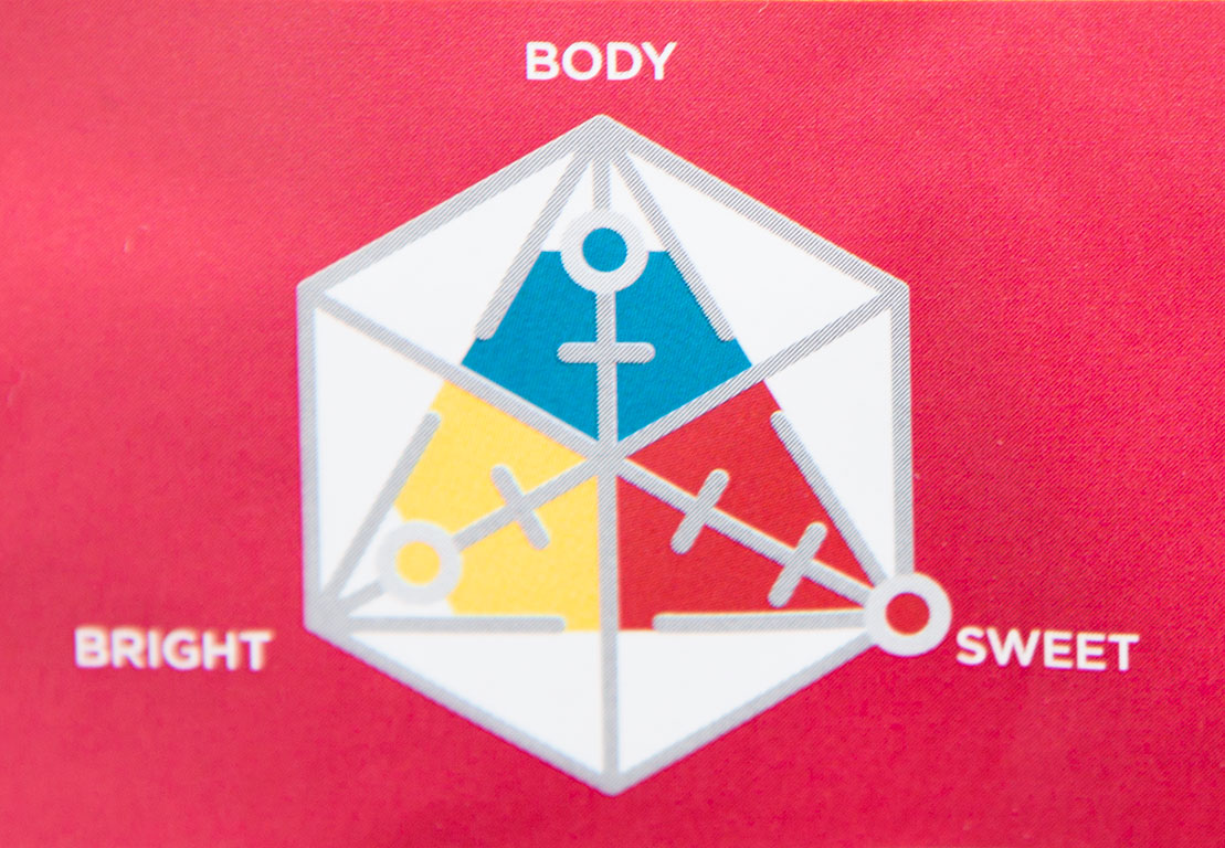
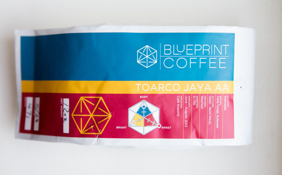
Taking all these factors into account, they decided to represent the flavor visually. Their flavor icon is a triangle with a characteristic—sweet, body, and bright—at each of the points. The intensity or prominence of a characteristic in a coffee is plotted on a three-point scale. Building on this, the characteristics are color-coded, a decision that Marquad says was influenced by an SCAA article on how color can affect a taste experience. In a branding coup, the icon is a riff on Blueprint’s logo.
It’s a bold approach to flavor that succeeds in many ways. It conveys its info quickly, it opens another avenue for thinking about flavor, it creates a standard across Blueprint’s coffees, and it’s gorgeous. But just as flavor descriptors do, it shows how difficult communicating flavor can be. The term bright, which Blueprint wisely chose over acidity, hasn’t penetrated the public’s understanding yet. Similarly, few drinkers probably think of coffee’s sweetness. That said, these are great ways to think about coffee, and with just a nudge a customer may latch onto the concepts. Think about how important bitter has become to describing hoppy beers in a positive way.
The flavor visual doesn’t stand alone. Country, region, altitude, process, varietal, harvest time, and, refreshingly, importer are all listed on the bag. Not included, is roast level. Even though it’s a huge driver of sales, Marquard says, “Its such a poor indicator of flavor.” The colors of the bag, taking that SCAA lesson further, even mirror the qualities of the coffee. It’s flavor as color. And Blueprint didn’t forgo flavor descriptors completely. For every coffee, Blueprint creates a robustly detailed info sheet for wholesale clients and coffee geeks, and there they do include tasting notes.
Describing flavor requires abstractions. Words work for many people, but for plenty of others a scale or colors will hit the same concepts with more force. Blueprint’s icon is a powerful foray into that way of representing coffee.
—Cory Eldridge is FreshCup’s editor.


