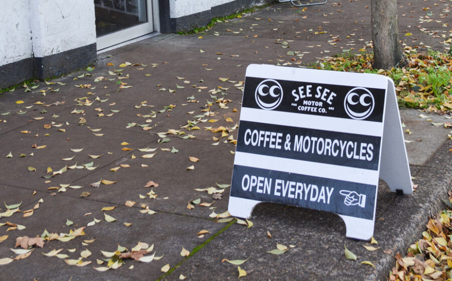
[S]andwich board, display board, A-frame, or advertising placard. It’s known by several names, but the goal of these—whatever you call them—is the same: entice foot and drive-by traffic into your café. We’ve talked to shop owners and have compiled some tips for making the most of passing traffic and send the right message to your customers. Here are our top ten!

1) Be clear
Make your message easy to read and simple. “Coffee” written clearly on a sign visible from the road is better than a catchy phrase that’s hard to read.
2) Stay true to your brand
Your sign is every potential customer’s first impression of your company. Is the sign dirty? Is it in your color scheme? What message does it send? Get an outside opinion and go from there.
3) Keep it Legal
Most, if not all cities have permitting regulations and requirements for sidewalk signs. Make sure you know your city’s rules to prevent a visit (and a fine) from the Man.
4) Consider security
Well-designed signs always face the unfortunate chance of being stolen. If your neighborhood is known for sticky fingers, find a way to secure your sign (subtly and legally) or at least make sure it’s within sight of your staff.
5) Make it beautiful
Beautiful, hand-painted signs can cost approximately the same as regular (boring) signs. Go with the well-designed and/or hand-painted sign. It’s much more visually appealing and tells a better story.

6) Make friends with artistic people
“I’ve been lucky to be surrounded by artistic people. I was able to give some ideas to Kev Hennessy, a customer of ours who does signs, and he did what looked best.”—Travis Coe, owner of newly opened Jet Black Coffee Company in Portland, Oregon.
7) Mind the details
If it has an arrow, make sure it’s pointing toward your café. You’d be surprised how often arrows point customers to other businesses.
8) Keep it clean, literally
If your sign is muddy, potential customers will associate your café with dirt. If innuendo is part of your brand identity, cool. If not, keep it figuratively clean too.
9) Maintain visibility
Your sign needs to be highly visible from the street. Make sure it’s not obscured by trees, bushes, or a late-in-the-day parked car. Test it yourself, and recruit friends to test it as well. A-frames are an investment; make sure it’s working hard for you every day.
10) Don’t take it too seriously
Your A-frame is an opportunity to show some personality. If you’ve picked a sign with a changeable message, rotate it often and keep it light. Make jokes, let your employees take a crack at it, and have some fun.
Check out other clever A-frame one-liners at #anotherltdaframe.
—Rachel Sandstrom Morrison is Fresh Cup‘s associate editor.


