[W]hen a coffee roaster or tea blender sells a bag or box or tin of their carefully crafted beans or leaves, they’ve sent customers home with more than just the product. A good package can be a brewing manual, a description of future experiences, a geography lesson, a declaration of values, and, when done right, it’s a bit of the company itself.
Throughout their histories, coffee and tea have been highly branded and ever since there has been product design some of the best has come from coffee and tea companies. What’s changed over the last few years is the proliferation of fantastic design and the expansion of motifs. For decades, maybe centuries, coffee and tea designs were predominated by exotic images, now design tends to reflect the location of the company or its personal quirks. (That said, nailing down a trend in design would not only be impossible it would be misleading.) The range of materials available to companies for showcasing their products is massive and only expanding.
A full accounting of the amazing design in coffee and tea packaging would fill several volumes of art books. The four companies here show that high-quality design doesn’t require a San Francisco or Williamsburg design house and that there’s a range of styles and methods that work. They also prove that design is a partnership, and the best work emerges when a designer and owner understand what they want and need to say with the piece of the company customers can hold in their hands.
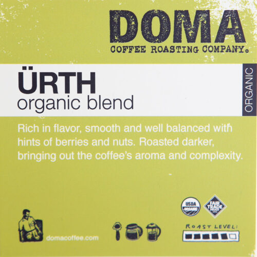
 DOMA COFFEE
 DOMA COFFEE
Some packaging focuses on repeatedly striking a single visual idea that establishes the brand. This usually works when the idea is something archetypal: Adidas’ athleticism or Apple’s techtopia. DOMA Coffee in Post Falls, Idaho, doesn’t shoot for a single idea with their packaging; the company believes in and stands for many things. “It is incredibly challenging to take the morals of your company and put it in a bag,” says Rebecca Patano, who owns DOMA with her husband, Terry. “That principled, authentic statement of what your company is: we are a sustainable, conscientious, fair trade, organic coffee roaster. How does that translate into packaging?”
DOMA’s highly varied packaging attempts to communicate many ideas while being clearly from one company. That is a harder pull, and it’s remarkable that DOMA makes it work.
The Patanos have a history with and deep understanding of design and seek out artistic collaborations, which in turn reflects their collaborations with local and regional organizations. The artistic pairings are most striking in the work they commission for their canisters, which ranges from tattooist line art to pop art inspired by Roy Lichtenstein. “It’s who we are. It’s easy for us to do this,” Patano says of this involved process. “It’s part of the way we launch a new coffee. It’s fun and it’s exciting.”

“We are obsessed with handcrafted sustainability and everything we do follows that model,” she says. That’s lead to all of their kraft bags being printed locally with a letterpress. “It is an absolutely unique and archaic and labor intensive process, which truly fits our profile,” Patano says. They’ve worked with the printer and their designer, Shelly Crosswhite of Crowberry, for years.
It’s impossible to recommend this sort of ever-shifting, hands-on approach to packaging and branding—the skill set and time it requires just don’t belong to most companies—but it can create a dense visual identity.

THE CANS
DOMA releases coffees in cans about three times a year. “If its a special, unique, amazing coffee, we try and feature it in the can to draw even more attention and use the space on the can to tell more of a story,” Patano says.
 SHELF TALKERS
Because the bags are printed with a letterpress, the information normally found on a bag of specialty coffee is provided by these cards that rest in the racks Patano
handcrafted for wholesalers.

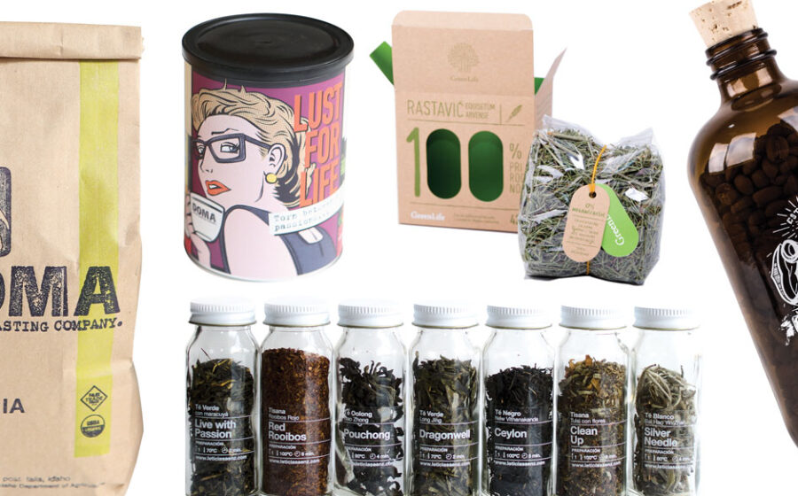
 GREENLIFE
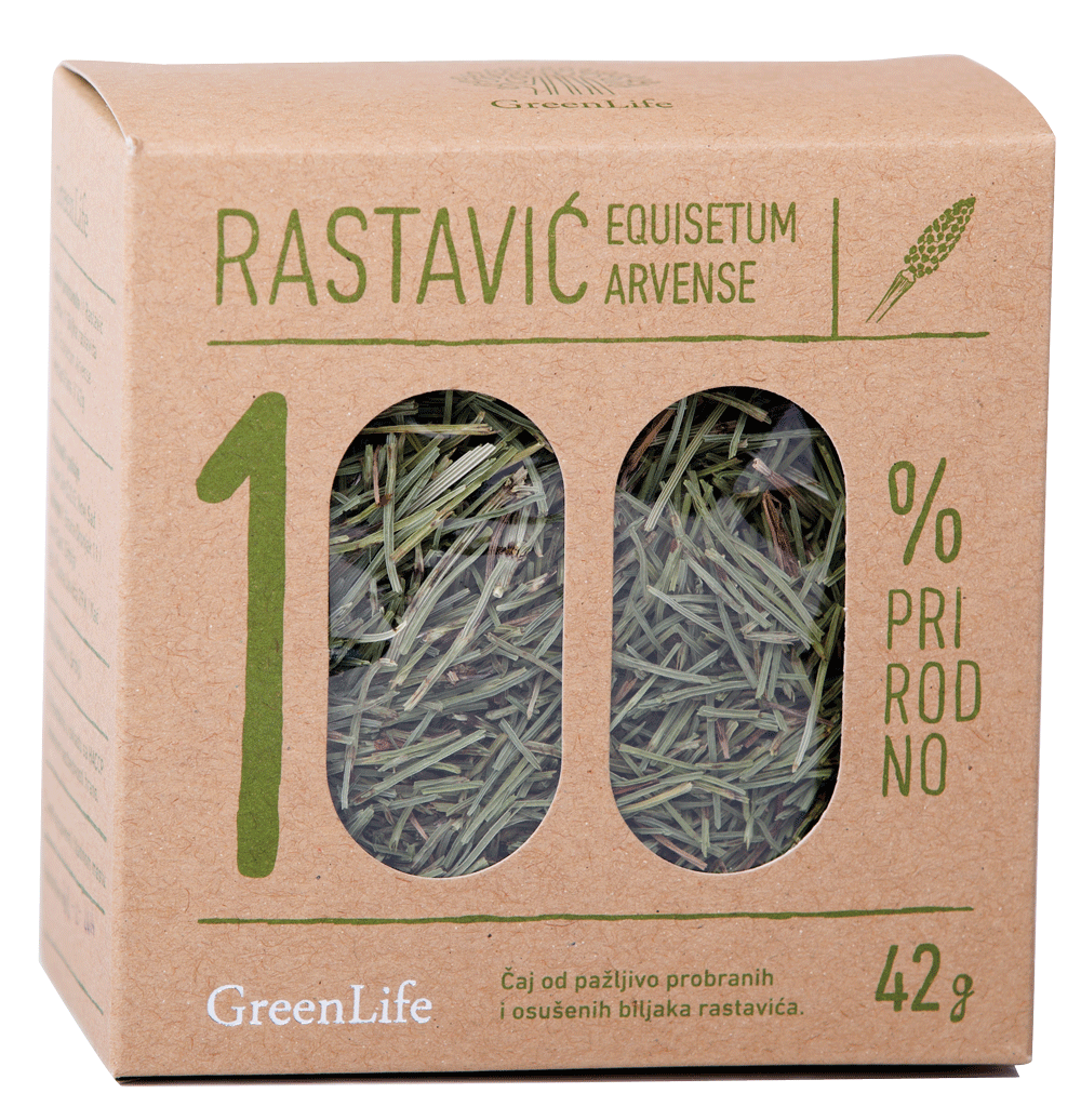
 GREENLIFE
GreenLife is a young and small tea company based in Novi Sad, Serbia’s second largest city located about an hour northwest of Belgrade on the Danube River. They focus heavily on tisanes long used in Central European and Balkan cuisine and medicine, like nettles, peppermint, marigold petals, lemon balm, and field horsetail. After their line began to take off, GreenLife asked Filip Nemet from Bullsheep, a Serbian design house, to remake their packaging.
One of GreenLife’s main requests was that Nemet highlight the all-natural quality of the products. Nemet ran with that, making it the dominant design element (prirodno means natural) and a motif for the package. “We took that direction because we wanted it to stand out amongst the competition and to have that sort of natural and homemade feeling,” he wrote in an e-mail exchange.
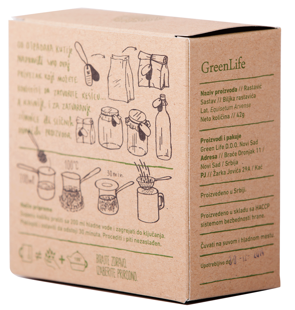
“We believe that the more information you can offer to a consumer the better, we tried to be as informative as we could,” Nemet wrote. “There has to be some information hierarchy, of course, but we thought it was good to offer some extra information as well, at least for the curious ones.” That additional info includes a paragraph about the box’s own sustainability and how to use the rubber band on the bag to keep the tisanes fresh, and how to use the bag and band after the tea is gone.
ILLUSTRATIONS
Every box has a simple illustration of the plant.
WINDOWS
The cutout zeroes aren’t just clever, they showcase the product. And not just an example of the product, but what you will take home.
THE BOX
The fibrous texture of the plain cardboard reinforces GreenLife’s all-natural message.
INSTRUCTIONS
Preparation is explained in four whimsical drawings that read like a story.
 ONYX COFFEE LAB
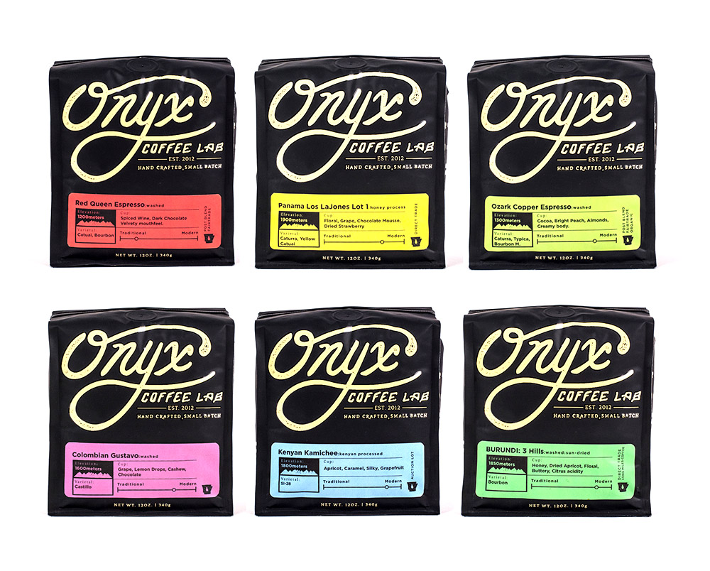 ONYX COFFEE LAB
Jon Allen and his Onyx Coffee Lab was a dream client for BLKBOXLabs when they teamed up in late 2012. Both were new companies based in Fayetteville, Arkansas, though Joey Nelson and Jeremy Teff at BLKBOXLabs (it’s pronounced black box labs) had bought coffee from Allen for years. “He wanted something that would standout in the coffee industry, something that would be different,” Nelson says. “He’s the perfect kind of client: he said that we have complete creative control.”
Handing over that kind of trust isn’t easy, but BLKBOXLabs was a perfect design house for Onyx. The team of designers immersed themselves in coffee and its culture, spending hours and hours at Onyx just drinking coffee. Allen was involved as well. He made Nelson draw enough sugar skull variations it could have caused diabetic shock.
The striking design of the packages, like some Wild West saloon advertising its Mardi Gras party, certainly evokes the look and feel of Onyx’s cafés. But where the immersion by BLKBOXLabs shines is in the label design for the specific coffees. Instead of just plopping the details in a bullet-point list they’re designed sharply and made part of the entire package. A lot of information receives crisp presentation. That requires a lot of knowledge and thinking about coffee. It’s unsurprising, then, that Nelson says, “My team has all become coffee drinkers, if they weren’t already.”
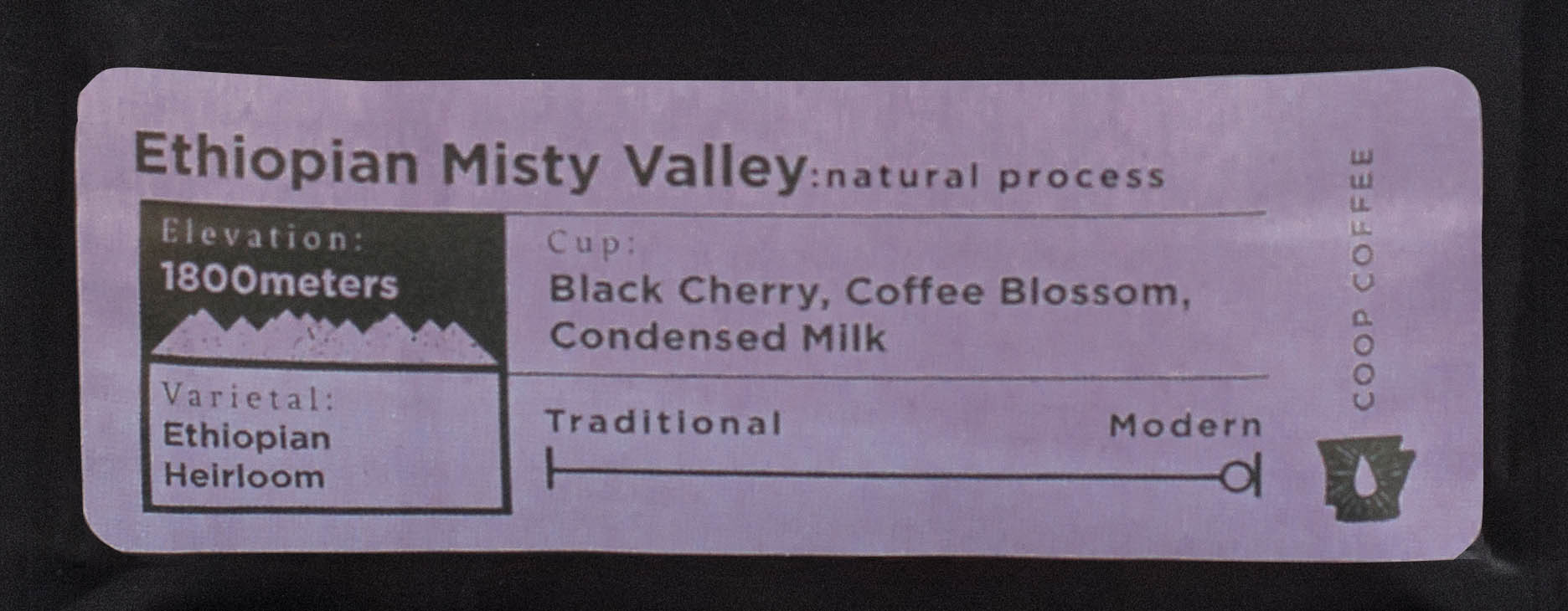
THE LABEL
“Anything that would actually impact the taste of the coffee, we wanted to put that on the label,” says the owner of Onyx Coffee Lab, Jon Allen. The “modern–traditional” scale is a tool for staff to help customers find a coffee they will enjoy.
 SQUARE BAG
The square, flat-bottomed bags had to be sourced from Japan.
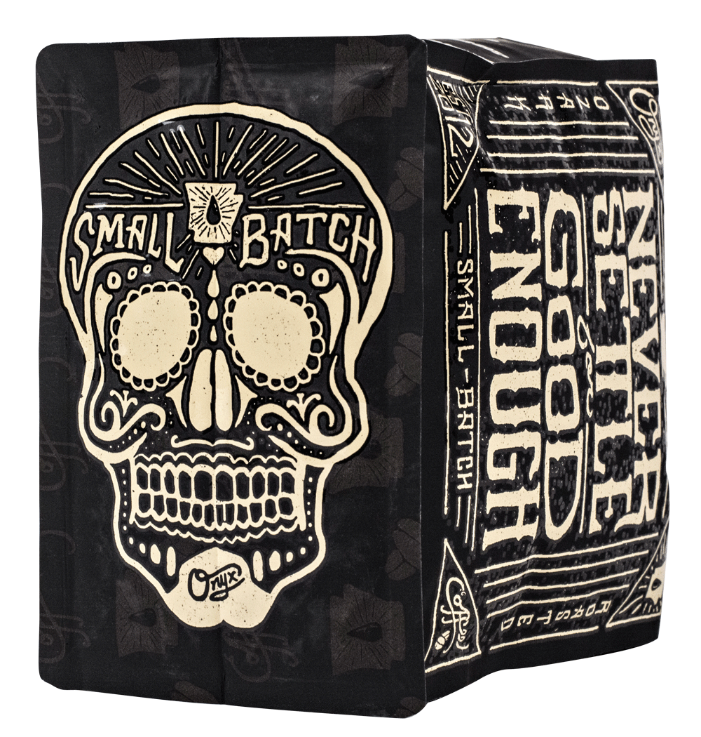
SUGAR SKULL
Allen says there is no deep significance to the sugar skull. He just wanted the package to include something “bad ass.”
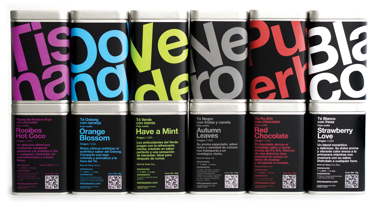
LETICIA SÁENZ
When Leticia Sáenz started her eponymous tea company in Mexico City in 2010 she wanted to avoid the hackneyed Victorian and East Asian motifs that predominate tea packaging. One decision guaranteed that wouldn’t happen: her choice of designer. Leonardo Paz, director of Leolab, uses typefaces as the predominant, sometimes sole, design element. Even the logos he creates resemble letters. Every designer brings a certain aesthetic, and Sáenz was destined to have a clean, bold, and modern look the moment she chose Paz.
While Sáenz wanted to avoid one tradition, Paz wanted to avoid another. “The first constraint was that we wanted to kill the classic concept of tea in Mexico. Our moms and grandmothers would say that tea was for when you got sick,” Paz says. “We wanted them to look at tea from another perspective.” Each broad class of tea (white, oolong, etc.) is color coded, giving the already robust lettering a chromatic wallop. The result is something that would be more at home in MOMA than abuela’s pantry.
Mexico’s tea culture is very young—“I like to call it a baby,” says Sáenz—and Spanish names for teas aren’t established, so Sáenz used the English names and then stuck with the language for her blends. Along with details like preparation, origin, and tasting notes, Sáenz includes a short paragraph to prepare the drinker for the taste experience. “I believe that storytelling makes the difference,” Sáenz says. “It helps you to remember. I wanted to do this with my tea. I strongly believe that every tea leaf has a story to tell and it begins to tell it the moment we begin to infuse it.
THE TINS
On several occasions Sáenz and Paz have been told by admirers that they collect the tins. The well-known reusability of tins is heightened by the artfulness of the design.
THE LOGO
 The logo is an outgrowth of the type-heavy design. Its four points represent the four pillars of a great cup: the tea, the time, the temperature, and the quantity.
SAN-SERIF FONT
As part of avoiding staid traditions, Paz used a san-serif typeface. “Serifs have been done a thousand times,” Paz says of other tea packaging. San-serifs make a package almost automatically modern.