This post is part of a series on menu development, which examines strategies for building a menu that reflects your brand and engages customers.
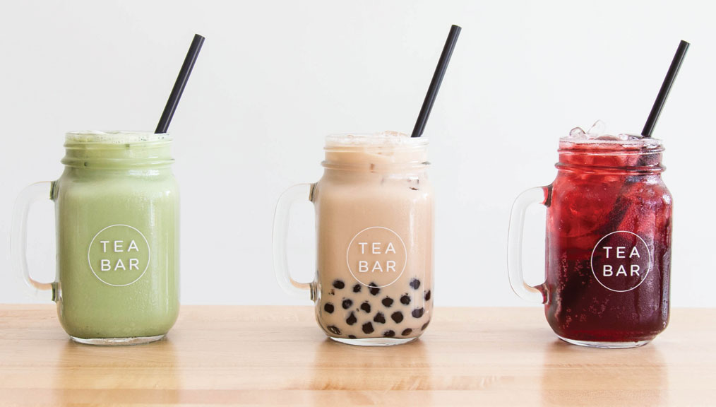
[T]ea Bar overall is very modern, simplistic, clean,” says owner Erica Indira Swanson. “To have that translate in everything we do—our products and our menu—is so important.” The block lettering of Tea Bar’s logo, along with the powder-blue accents, carries over to their single-page menu that sits on the bar. The text is designed with a mix of fonts and weights to improve readability.
The menu changes every season to reflect new drink specials—using a laminated countertop menu makes it easy to update. Swanson views the menu as a dynamic tool to engage her staff and customers. “It gives the team an opportunity to be involved and give input on new recipes and lets people know they’re not just settling for the basic menu all the time,” she says.
More popular drinks take up prime real estate, like the selection of boba teas and the rotating seasonal drinks. According to Swanson, dedicating this space reflects customer preferences, but also serves to promote higher revenue drinks. Limiting prices to dollar and half-dollar amounts keeps things clean (Oregon has no sales tax, so change is easy), and offering only two sizes improves bar flow.
When it comes to decision-making, Swanson uses her Square software to assess sales and make any necessary cuts. “Less options is more appealing,” she says. “You get so many options and it gets even more confusing, both for the people working and the people ordering.” Part of keeping fewer options on the menu is training staff to be knowledgeable on all the ingredients and how they can be combined to meet a customer’s needs.
–Ellie Bradley is Fresh Cup’s associate editor.

More in this series:


