Coffee packaging isn’t just about keeping your coffee fresh. Your coffee bag’s design can communicate the values of your brand and the uniqueness of your products, making the difference between a bag that grabs a customer’s attention and one that languishes on the shelf.
We spoke with three specialty roasters to find out how they designed their coffee packaging. From developing distinctive artwork to working with design experts, we explore the key considerations that helped these coffee brands craft something distinct, eye-catching, and memorable for customers.
Roasters Stand Out With Unexpected, Sustainable Packaging
As reported by IBIS World, the number of coffee roasters in the US has been growing at an average rate of 4.5% per year between 2018-2023. In 2013, there were approximately 1,300 coffee production businesses in the US, and by 2023, the number had risen to over 2,100. With the market becoming increasingly saturated, new roasters face a steep challenge: how to make an impression on potential customers.
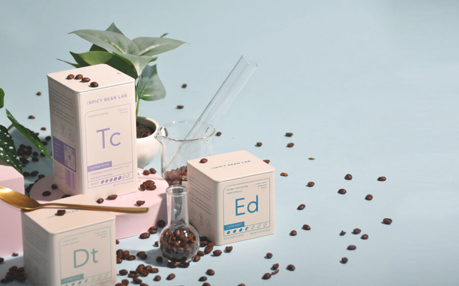
Shey Nacpil says the need to stand out as an emerging startup inspired her to try something different. The co-founder of The Spicy Bean Lab, a direct-to-consumer roastery that features coffees exclusively from Brazil and Colombia, says the first step in her design process was to choose a type of packaging. Wanting to stand out, she proposed using tin cans. “It’s different from the big brand names,” she says. “It’s also sustainable and reusable, so I think it’s more appealing to everyone.”
Sustainability is becoming an increasingly important influence on what consumers choose to buy. A 2021 study by Accenture found that 72% of consumers are more likely to buy from companies that prioritize sustainability. Additionally, a study by the Boston Consulting Group revealed that more than one-third of Gen Z consumers are willing to pay more for sustainable products.
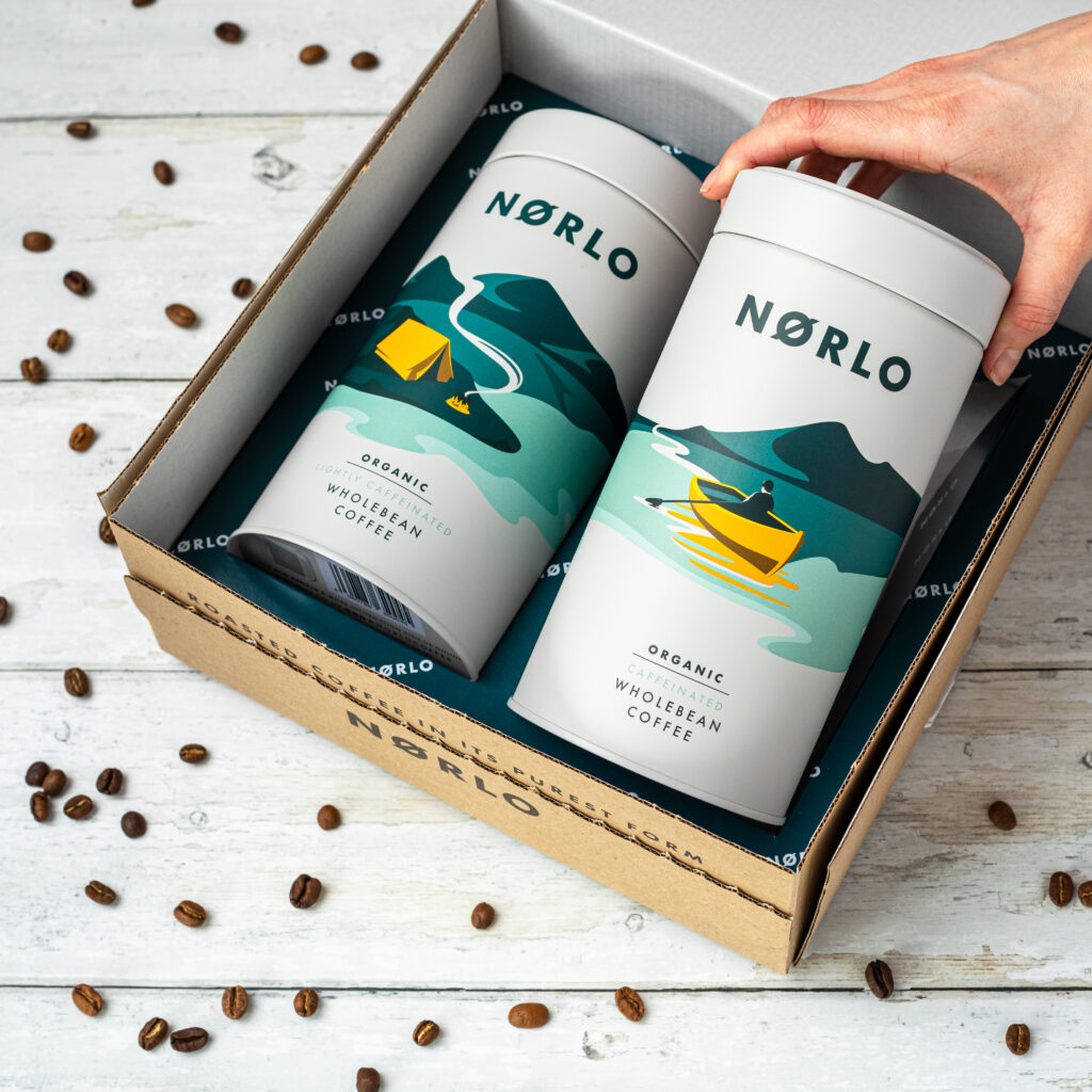
“Most retail coffee bags are composed of multiple layers, each of which has to be separated before disposal, which, of course, few people do. Aluminum tins are infinitely recyclable, plus they’re reusable too,” explains Dan Norman, co-founder of Norlo, a coffee brand based in the UK. He runs the company alongside his wife, Steph Norman.
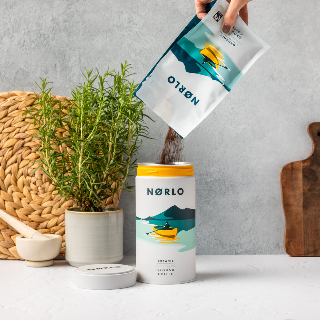
Norlo also sells refill packs for their tins in recyclable coffee bags. “We wanted to address three key items in our packaging: sustainability, uniqueness, and refillable,” says Norman. He notes that using a cylindrical tin allowed for more creative branding options because the design wraps around the container. “Stylistically, cylindrical tins also massively benefitted our branding.”
But after choosing a packaging format, where should roasters look to find the right designer to work with?
Working With Designers To Bring Your Vision To Life
When it comes to finding the right designer, many roasters turn to their peers for referrals. Nacpil discovered the designer for The Spicy Bean Lab through a recommendation, although they developed their initial concept in-house.
“When we worked with a designer, it was more like hiring them to execute the design that we had made,” says Nacpil. “We did the actual sketch, and the designer rendered the actual file to make it printable.”
The Spicy Bean Lab’s reusable coffee tins can double as a display piece, container, or small plant vase once the ground coffee is finished. Its design evokes the periodic table of elements to symbolize a lab, a nod to Nacpil’s medical background.
The design agency behind Norlo’s packaging also came from a referral. “We make a point of going with recommendations as much as possible. There are so many people to choose from with little way of knowing whether they will deliver what you want,” explains Norman, adding that he and his wife often regretted the times when they hired outside of referrals.
The Normans sifted through all their recommendations and talked to several design agencies to help realize their brand vision, which takes inspiration from Oslo’s coffee scene. They landed on Design Happy, a UK-based firm that’s worked with brands such as Tropicana and Bondi Sands.
“An important element in our design brief was that the concept had to be translatable,” says Norman. “For example, we launched new ready-to-drink iced coffees this year and developed two yellow icons to differentiate the product, but still very much in keeping with the brand concept.”
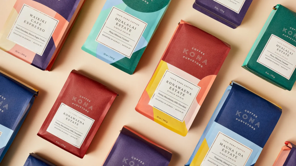
When Raymond and Jackie Suiter were looking to update the branding and coffee bag design for their roastery, Kona Coffee Purveyors in Honolulu, Hawaii, they looked to photography for inspiration.
Their coffee bags’ vibrant palettes feature colors sourced from photos of Hawaii’s rich landscapes, including its coastline, volcanoes, and the hues of dawn and dusk.
Although no design firm is the same, oftentimes, it’s better to take a hands-off approach that allows designers room to explore and be creative. “We worked with an amazing packaging company in Montreal, but they let me do very little directing,” says Suiter.
That doesn’t mean you shouldn’t share ideas or inspiration images with the design team—that’s what Suiter did when he presented the design team with a series of four photos he used as a starting point for design discussions. “The one direction that I gave them was I wanted the colors to come from these images,” adds Suiter. A plan is underway to showcase the landscape photos they used in a visual display inside the Kona Coffee Purveyors cafe.
Norman emphasizes the most critical step in the design process is discussing a clear overall vision for the brand concept early on “without being too specific so as not to limit their creative scope,” he says. “After all, it’s their expertise you’re paying for, and you’ll likely be blown away with design concepts you’d never have thought of.”
In the end, putting faith in their designers paid off. Norlo and Kona Coffee Purveyors were finalists in The 2021 Coffee Design Awards, an annual showcase and competition hosted by the Specialty Coffee Association celebrating the industry’s best in coffee packaging, drinking vessels, branding, and more.
It’s All in the Details
Figuring out the perfect balance of information to showcase on your packaging starts with identifying what makes your coffee special. From flavor notes to origin and the type of roast, it’s all about highlighting the unique qualities of your coffee.
“Being a Scandi-inspired concept, Norlo’s brand packaging was always going to be minimalist,” explains Norman, “It was designed to reflect the cleanliness, uniqueness, and bright coffee that it housed. We made a conscious decision not to display coffee origin, as we wanted our blend’s taste to be synonymous with Norlo.”
For Kona Coffee Purveyors, origin and attention to detail set their roast apart. They take pride in their roast, prominently displaying the batch number and roast date on the front of the bag.
“We use a system called Cropster that records every roast,” says Suiter. “If there’s ever an issue with the coffee, we can go into the batch number and look at the cupping notes. You’ll never get a batch that hasn’t been tasted by us.”
When creating the packaging for The Spicy Bean Lab’s coffee, Nacpil focused on clarity: Spicy Bean features a variety of flavored coffees, and each flavor is prominently displayed on the front of their tins, along with roast profile (indicated through a 1-7 scale, with each number represented by a coffee bean—the more shaded in beans, the darker the roast).
In the end, Nacpil recognized the importance of every detail, knowing it’s the small things that help a brand stand out. “Those little details are very important but easy to overlook.”


