In 2015, Ashley Jaffe and Zach Israel set out to design a New York City café that would feel like an extension of a customer’s home or office. After scouting properties, the husband and wife team chose a space on Madison Avenue for their NoMad location.
Curiosity got the best of them during the build-out, as the couple wondered what was lurking behind the drywall lining their shop. They began to tap on it, and to their surprise, it sounded hollow.
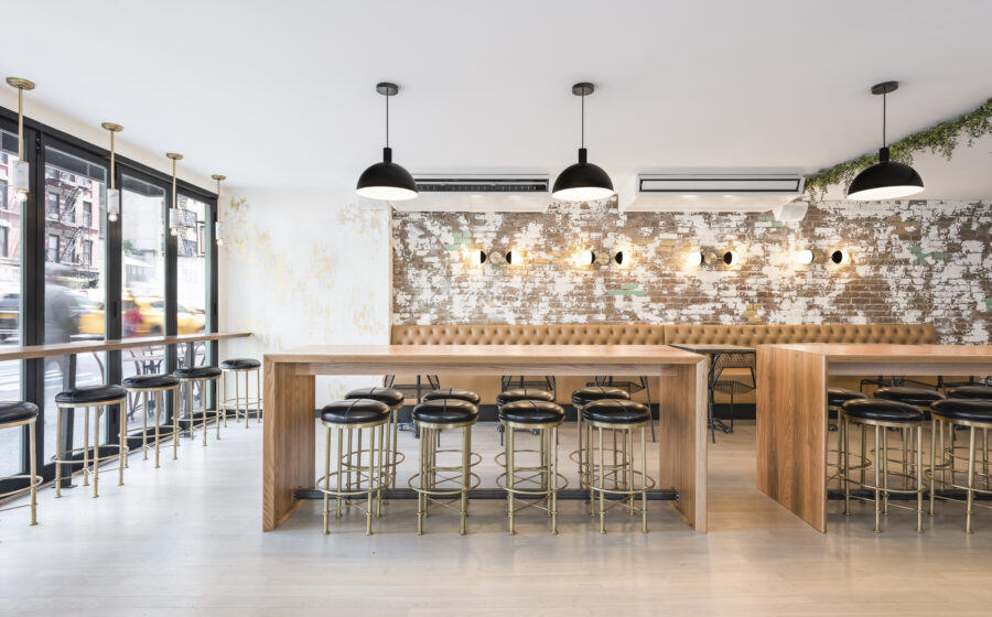
Knocking harder, they discovered an entire wall of exposed brick concealed behind the drywall. “It was the most gorgeous, imperfectly shaped brick wall that, for some reason, someone covered up,” says Jaffe.
Without a second thought, the owners unanimously decided to incorporate the exposed brick wall into their design plans. The natural texture and warmth of the brick became a defining element of Blank Slate Kitchen + Coffee.
In today’s digital age, customers often search for a coffee shop on Instagram or Google before deciding to visit. As a result, Jaffe believes the photos of your café interior are just as important as the in-person experience for attracting guests: “That’s what drives your customers,” she says.
While social media and virtual platforms can’t replicate the experience of a barista serving you a drink or the taste of freshly brewed coffee, design choices serve as a bridge that allows customers to get to know you from afar. They also can keep customers coming back—well-designed cafes invest both in the big, eye-catching elements that draw people in and the small, considered choices that make people feel welcome and embraced.
A Space That Feels Like Home
Both layout and design are essential elements to building a successful coffee shop. While your café layout focuses on ensuring an efficient operation—with designated areas for waiting, picking up orders, and comfortable seating for customers—the design is about what looks great and can serve as a visual interpretation of your shop’s values.
“The layout itself is all about what’s going to be the most profitable, generate the most revenue, and create a comfortable and welcoming environment for customers,” says Jaffe. “Design is the fun part—it’s all about the aesthetic.”
Blank Slate embraced the modern industrial design trend. But according to Jaffe, the style needed adaptation to create a welcoming atmosphere. She notes that some industrial spaces lack the feeling of warmth and comfort. “My goal was to find the warm version of the industrial look,” she explains.
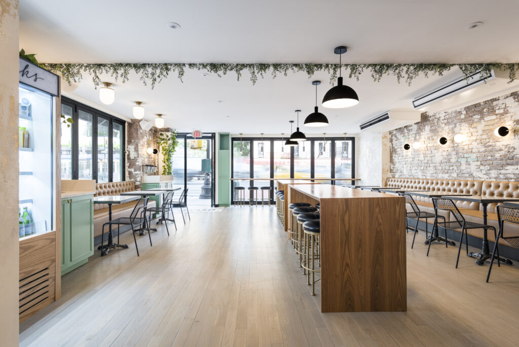
To achieve this, the team used a combination of exposed brick and painted walls. They also kept certain industrial elements exposed, such as a giant silver air conditioner tube. However, the pair also leaned on experts to create warmer accents that made the café feel welcoming.
We worked hard on those warmer touches to be inviting, so that when someone comes in, they don’t just want to get their coffee and walk out. They want to stay with us, work on their laptop, and get their second cup of coffee and lunch. Ashley jaffee, blank slate
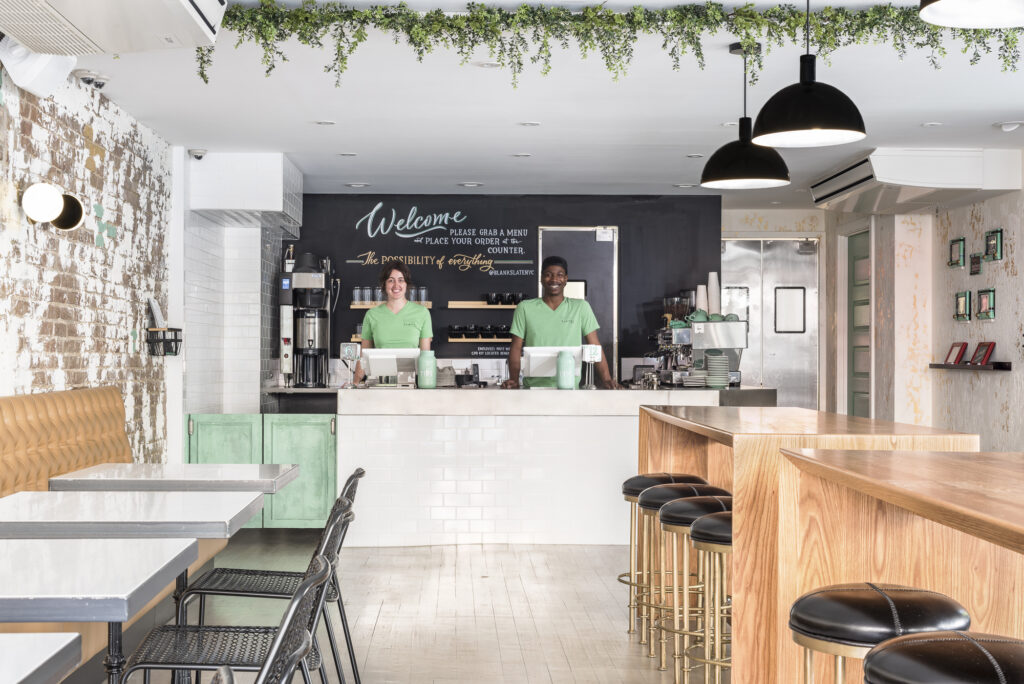
For instance, Jaffe and Israel wanted a color scheme that felt cool and calming. When their marketing specialist offered a mint green palette, it became the basis of their color scheme. From there, the team added accent colors such as black, white, and gold to complete the look.
“We worked hard on those warmer touches to be inviting,” she explains, “so that when someone comes in, they don’t just want to get their coffee and walk out. They want to stay with us, work on their laptop, and get their second cup of coffee and lunch.”
When Jaffe and Israel decided to open a second location in Midtown, they wanted to ensure the cafe design felt consistent with their first Blank Slate location. “We were lucky to have exposed brick in both locations,” Jaffe says. In addition, they brought over other design details like the tiling on the front of the counter and the wallpaper in the bathroom—and they even replicated their signature bright green bathroom door.
While Jaffe designed many of the aesthetic elements of the stores, she recommends relying on the expertise of specialists for specific design areas where she lacked expertise. Major layout decisions, like table and chair placement, were left to architects, and they also hired experts for painting, lighting, and wallpaper design.
Jaffe emphasizes the importance of working with different experts rather than relying on a single general contractor. “Not everybody is great at everything, so it’s been nice to work with different specialists,” she says.
And by leveraging the skills and knowledge of various experts to execute their vision, Blank Slate has built a reputation for modern, minimalist design along with great coffee.
Designing for Impact
Another East Coast café was undergoing a build-out in 2015. Chris MacLeod and Camila Ramos, the owners of All Day in Miami, Fl., had a vision for an open, airy space that paid homage to South Florida living with elements like green accents, brass finishes, and a double-height ceiling that features a hanging piece of driftwood from Key Biscayne.
“We got a chainsaw, tied it to Chris’ boat, and dragged the driftwood through the bay,” Ramos recounted. This down-to-earth element is just one of the many that make All Day an Instagram-worthy space.
The café boasts a double high ceiling with a mezzanine level and an open railing that looks down into an atrium, giving an expansive feel despite its relatively small footprint, says MacLeod.
Ramos explains the low counter height was another intentional choice to create a sense of invitation rather than a barrier. “We hand-picked each element individually, which added significant time to the build-out,” she adds, noting that construction took 16 months to complete.
This attention to detail is evident throughout the space, from the custom bar rails that facilitate pour-overs to the carefully selected furniture that allows for negative space and a feeling of airiness. All Day’s custom-made La Marzocco Strada espresso machine, installed seven years ago, was the largest in the world at the time—and is still used today to prepare coffee.
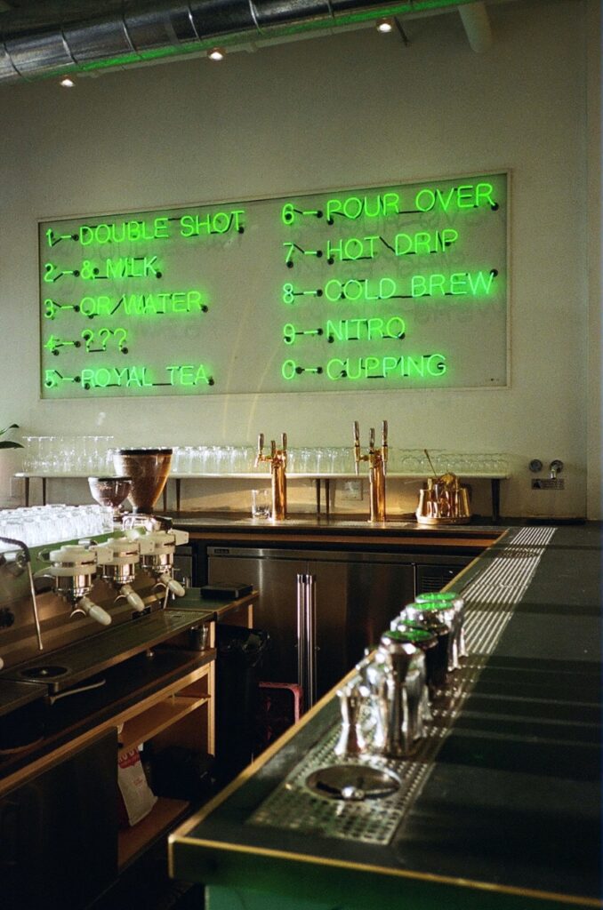
The neon menu above the bar is the signature of All Day and a favorite among patrons. “People love taking photos of it,” says Ramos. While a fixed menu might seem limiting, she explains it’s a conceptual menu, and the printed menu expands further. “My job was to see what information was least likely to change, like what we call certain drinks and what drinks are going to be staples on our menu.”
Rather than a straightforward list of drinks, their display menu offers categories of playful drink titles such as “Double Shot,” “& Milk,” and “Or Water.” The physical printed menu then lists the drinks offered under these headings. The goal, according to Ramos, is to encourage conversation between guests and baristas. “Miami is an international city. It was important for us to communicate exactly what we are serving,” she says.
MacLeod drew inspiration for the neon menu at All Day from a trip he took to Japan. While visiting a modern art museum on the island of Ashima, he saw an impactful piece of work made up of worded neon signs that stuck with him: artist Bruce Naumann’s 1984 piece, “One Hundred Live and Die.”
When it came time to brainstorm ideas for presenting their menu, MacLeod suggested using a neon sign. “We had to decide whether it would be possible because, obviously, you can’t change much once it’s up in neon,” he explains.
In addition to its core menu, All Day offers rotating specials, including a drink marked by three neon question marks that always spark curiosity from customers. “That rotates, and everyone asks, ‘What are the question marks?’ and then we get to talk about it,” says Ramos.
From the furniture and lighting to the decor and layout, every aspect of café design should work together to create a cohesive and inviting atmosphere. The signature neon menu above the bar at All Day is just one example of how unique design elements can become an iconic symbol of a coffee shop—and even a favorite among customers. When you look through Blank Slate’s tagged Instagram photos, you’ll find shots with pops of their signature bright green in everything from their decor to coffee mugs. On the other hand, All Day’s feed is filled with photos highlighting their iconic neon menu, along with lots of nice plant shots and printed menus that look straight out of a fashion magazine.
Creating a space that is both visually appealing and functional can be a daunting task, but it’s worth the effort. And in today’s age of social media, having an Instagram-worthy space can even help your shop go viral and find a new audience. It’s hard to communicate what your coffee tastes like without patrons coming in and sampling your offerings, but a well-designed cafe can attract customers and keep them coming back for more.

