(Photo: Hannah Westby Elate Photo)
This post is part of a series on menu development, which examines strategies for building a menu that reflects your brand and engages customers.
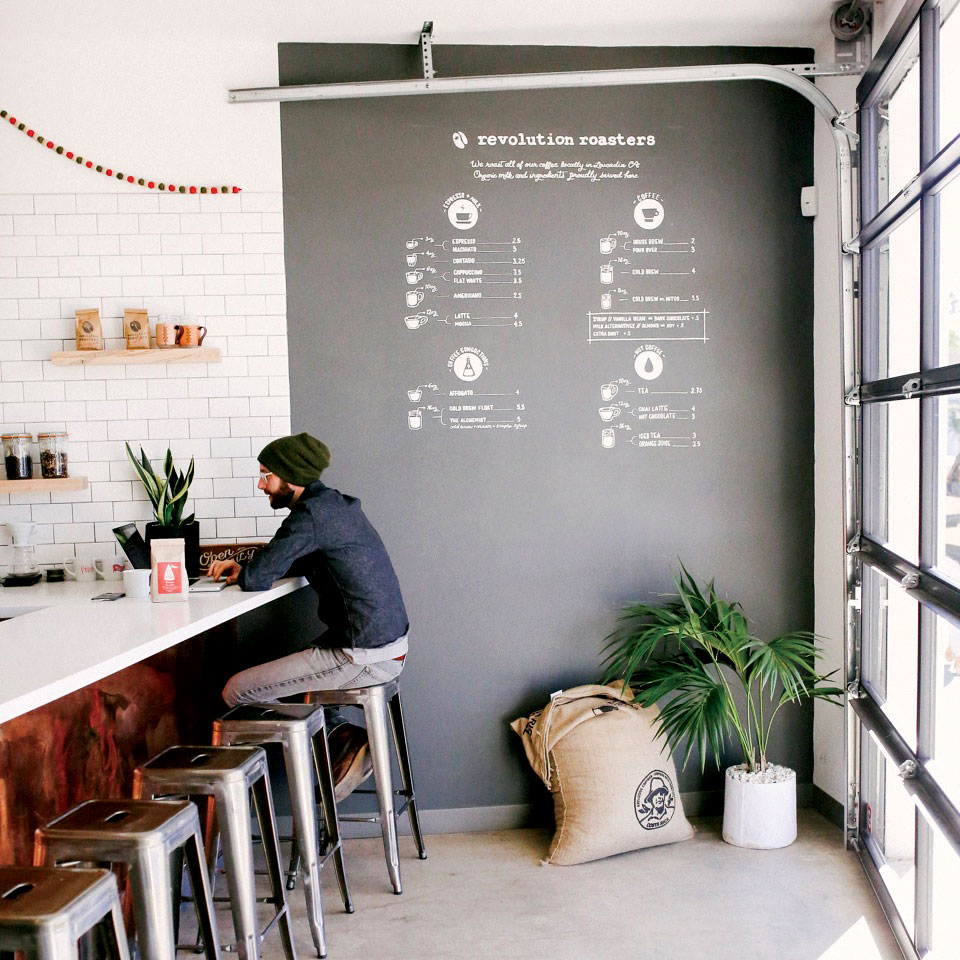
[R]evolution Roasters is the first specialty coffee roaster in Oceanside, California. In a community where many people are exploring coffee’s third wave for the first time, a menu loaded with visual cues makes a lot of sense. “We really want to be by the people, for the people,” says Revolution operations manager Isabel Bernegger. “We’re really trying to make it so that people have extreme accessibility to specialty coffee.”
Co-owner Mariah Scheibe wanted the menu to be the first thing customers saw when they entered the space, something that was approachable and easy to read. So she recruited artist Megan Snedeker of Pearl & Pen to bring her vision to life. The menu is as much functional as it is a design element. Spanning the full wall next to the bar, an illustration accompanies each listing, letting customers know the size of each drink, as well as the type of drinkware. Four main categories make it easy to find what you’re looking for: espresso and milk, coffee, coffee concoctions, and not coffee.
“We take great pride in all the drinks that we make, but we really want people to come in here and feel like they’re at home, not just with our physical space, but with our offerings,” Bernegger says. Revolution made a choice to include a wide range of drinks. “If anyone walks in, we want them to be able to get exactly what they want and an excellent version of it, made with incredible ingredients,” she says.
Bernegger says the hope behind the menu, and behind Revolution, is to meet people where they are. By greeting customers with an informative menu, it sets a tone for education and exploration—people can glean as much or as little info as they like. “We wanted customers to feel like specialty coffee wasn’t something that was blocking them out,” she says.
–Ellie Bradley is Fresh Cup’s associate editor.
More in this series:


