This article was originally published on January 30, 2019.
Are your signs conveying the right message? The moment a new customer walks through your door, they’re looking for signs to navigate an unfamiliar space.
Well-designed signage allows customers to comfortably order food and beverages, find their way around the space, learn about your brand and products, and even share your space with social media followers.
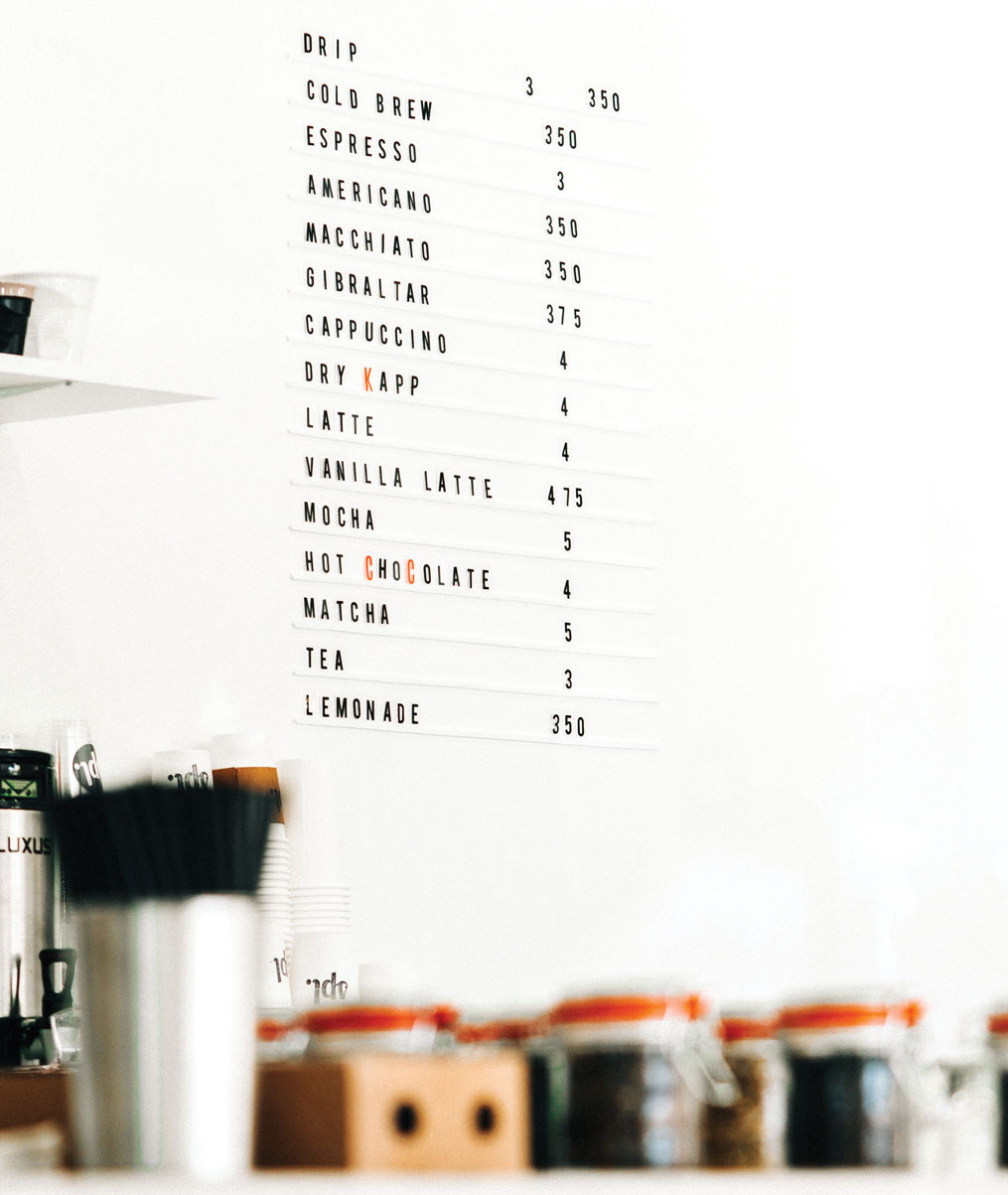
There are endless options these days: painstakingly handcrafted signs painted by professional artists, tried-and-true chalkboard signs, high-tech LED screens that show high-res photos of products, and the trendy letter boards of 2018.
We talked to experts in sign manufacturing, interior design, and people who run cafés on the best way to ensure your café communicates the message you want customers to receive.
Looking for a Sign
Andee Hess, the founder of Osmose Design in Portland, Oregon, has a track record of designing influential interiors for trendsetting food and drink brands, including Stumptown Coffee Roasters, Salt & Straw, and Small Tea in Miami, Florida.
“We always start with a client, helping them define who they are, and getting a good understanding of the brand, their voice, and how they interact with their customers,” says Hess. “Even when we start to look at menus and all these other little pieces, it needs to tie back to this core of who the company is, who the brand is, and how they want to be represented.”
Whether you’re planning the buildout of your first café, opening a second location, or redesigning a few shop elements, it’s a good practice to take some time to define your brand and who your audience is.
“As [café owners] are still developing their brand identity, it’s really important to figure out who their target customer base is going to be,” advises Joseph Hewitt. Hewitt is a creative technologist and fabricator for Fortitude, a design and manufacturing firm in Portland, Oregon, who redesigned Stumptown’s menus in 2018. “That can be very different depending on where the café is or the personal style of the person opening it. You don’t want to get sick of something you’re going to be in and around every day.”
If you’re going to open a location in a part of town that you’re unfamiliar with, get to know the locals. Do you want to serve hurried professionals in the early morning on their way to work or the lingering parents and their pre-K toddlers in the afternoon? Both? While a rushed banker in the morning won’t care much about where your restrooms are, you can be sure that a parent with a messy eater will feel at ease knowing there’s a washroom nearby and whether or not they’ll need to ask for a key.
Thinking about local demographics, who you want to attract, their unique needs, and their aesthetic preferences will be essential in selecting verbiage and materials that are welcoming and useful to customers.
Once you’ve defined your target market, start gathering examples of design elements, colors, typography, and materials that your customers will respond positively to and that you’re excited about as well. Use these examples to develop an overall mood or concept for what your space will communicate.
Serving Sayings
Menu items should be determined by brand identity, customer preferences, and what the café space can produce.
Consider whether you will include origin names next to your brewed coffee offering. Will you promote a selection of flavored syrups to add to lattes? Will you offer food? What kind of food makes sense in your space, that your customers will like, and is on brand?
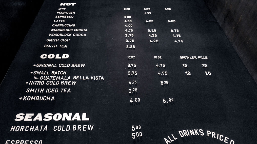
Write exactly what you want customers to see when they read your menu and group items based on categories such as coffee, tea smoothies, food, etc. Also, think about how often you plan on changing menu items, whether prices are likely to change, and where the best spot in your café is to place this information. This step will be key when determining what the menu looks like.
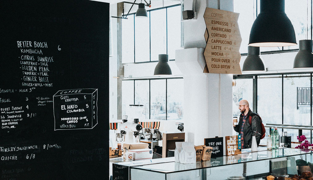
Queensberry Coffee (formerly Black Eye Coffee) in Denver, Colorado, features two menu boards: a vintage mirror salvaged from a local bar features the shop’s coffee offerings, while a roll of butcher paper displays food offerings and is rewritten twice a year for seasonality. Michelle Ackerman, Queensberry’s owner, chose that format specifically because the coffee offerings remain fairly constant while the food menu is refreshed seasonally.
And on the rare occasion that Queensberry has to change its coffee prices?
“It’s basically a sticker that’s been made that we stick onto the glass, onto the mirror,” says Ackerman.
Read the Room
Menus communicate your product offering, but there’s also the rest of the space to consider. There’s wayfinding, regulatory, informative, retail, and branded signage to fill your space with. Every word choice reflects your brand and can inform the customer experience, but some experts caution against over-communicating.
“Finding those words when working with clients is an exercise of being really concise and narrowing down what you’re trying to communicate,” says Hess. “Finding those words, again, gets back to that core conceptual, ‘Who is the brand, why are we doing this, what are we trying to say?’”
When planning signage throughout the shop, Hess advises that owners take the information they’ve developed to describe their brand and distill it into the most concise language possible.
“People are smart,” she laughs. “They will figure it out. We don’t have to dumb it down for them too much.” Less text also saves hassle later on, as phrasing and certain language can become dated and need refreshing. Try using icons or images where possible, as they can have a more emotional tie to your customers.
Ackerman used vintage postcards of Denver and famous boxers for her table numbers at Queensberry. The cards let the kitchen know where to deliver food while customers, unprompted, often take photos of the unique and personal touch for social media.
“We definitely think about the brand and how we want to maintain a certain brand image,” says Ackerman. “We’re also very thoughtful about Instagram. Because the more Instagram-able everything is, the more visibility that brings to it.”
Test Your Type
One simple and inexpensive way to test out the functionality of your signage placement is to run a prototype test using design thinking. With just some paper, a marker, tape, and a few friends, you can create a mock-up of your signage in the space and simulate a regular day of business. Invite some friends who are unfamiliar with the space and have them pretend that they are new customers coming in to order drinks and navigate the space.
After 10 minutes or so, talk to your participants to find out what questions they had and if your design had the desired effect. It’s far cheaper at this stage to take feedback and alter the design rather than later after everything has been manufactured. You may need to run this exercise a few times before you find what works.
Sign Into Effect
Now comes the fun part: making all your concepts a reality.
“It’s creating that story,” explains Hewitt. “It’s creating that storyline that will get people interested in not only what you’re selling, but why you’re there.”
Choosing materials, typography, colors, size, and placement of your signs should communicate a consistent story and feel throughout your space.
If you’re building your shop from scratch, you may want to find an interior designer who can develop a complete buildout and design concept for you. If you’re designing the buildout yourself or only refreshing your signage, you can work directly with commercial companies, like Fastsigns, or local artists. Ackerman reached out to her customer base when it came time to design new signage.
“We get a lot of our ideas from regulars,” she says. “The butcher [paper], the artist is a regular here; they come in quite a bit. And I think that’s what’s so cool about coffee and community, is that your customers are such a great source, and just talking to your customers about what you’re looking for. It’s really great to engage with the community at that level.”
Make sure that whomever you’re working with understands your brand aesthetics, customer needs, and placement by having a conversation with the designer using examples from your mood board to demonstrate what you’re looking for.
Often when working with a branding firm, graphic designer, or interior designer, they’ll be able to draft a digital mock-up of the buildout so you can get a sense of where text will appear, the scale, and color choices.
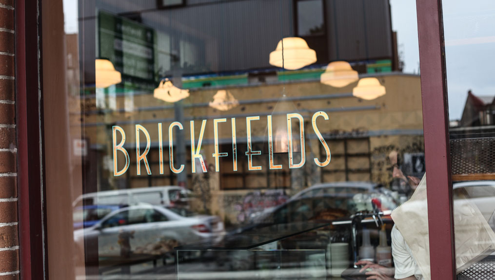
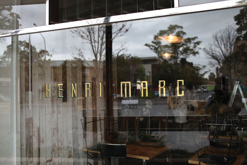
Will Lynes is a Sydney-based sign designer whose company, Lynes & Co., specializes in hand-painted signage, gilding, and decorative glasswork. Lynes recommends that café owners think thoroughly about physical material and their appearance in real life before committing to a particular design.
“There’s a little bit of a disconnect between how [the sign] looks on screen mocked up versus how it looks in real life when you actually view it,” he says. Lynes recommends talking to more than one design professional and using their expert opinions to inform design decisions.
When completed, well-functioning signage will build a base of regular customers and boost sales. Ackerman found that the scale and placement of her menu board play a big role in managing lines.
“Functionally, it’s really nice because people can make it through the line pretty quickly, and they’re able to see what’s offered and instantly know what they want, as opposed to wandering around trying to decide,” she says.
Reading the Future
In just the last decade, signage trends have changed drastically. Neon, custom letter boards, and “Insta-worthy” signage have all become ubiquitous in café spaces worldwide. Social media platforms like Instagram and Pinterest are the likely cause behind these shifts in taste.
“A venue opens and becomes really popular, people Instagram it, and then that kind of builds up their presence online,” remarks Lynes. “Then people start to notice and tend to look at that place as a guide as to what to follow, almost as a formula.”
While social media can be an excellent source of inspiration and a great marketing tool, overemphasizing social media’s importance can lead to derivative design or signage choices that will quickly become dated.
“People are always asking for those Instagram-able moments, right?” notes Hess. “If you’re providing something that’s more complex and has some more thought in it and has the message interwoven cleverly, I think that’s more exciting.”
Looking forward to what the next signage trends will be invading our social media feeds, Hewitt suggests flip disc signs similar to those found in train stations. “You hear this acoustic clattering, and visually, it kind of looks like a word jumble, and then all of a sudden, the information comes out of it.”
Hess is excited to integrate more backlit and glowing graphics into her work.
“You can read it, it produces light in the space,” she says. “That’s kind of a challenge to us, of what’s another way to integrate on that idea where it’s like using technology more than a flat board with a light shining on it.”
Whatever ends up as the next big thing, café owners should always ensure that their signage makes sense for their brand, customers, and business.
Cover photo by Will Lynes.
This article was originally published on January 30, 2019 and has been updated to meet Fresh Cup’s current editorial standards.


