This post is part of a special section on build–outs for the contemporary café. Read more posts from the section here.
[H]enry Kalebjian’s roasting experience spans more than fifty years. He showcases his expertise at Henry’s House of Coffee in the Sunset District of San Francisco, California. Coffee is a Kalebjian family tradition, solidified when Henry’s son, Hrag, joined the business in July 2013. Though the Kalebjians are backed by decades of practice, ushering the House of Coffee into a new generation of coffee presented its own challenge: honoring the company’s rich history while still being competitive in the contemporary market.
The Noriega Street shop opened over fifty years ago, operating as a specialty foods store in its early days. Henry purchased the business in 1983, along with the two-story building (a two-bedroom apartment occupies the upstairs). In 1995, he remodeled the downstairs space to be more coffee-focused, expanding into some of the building’s garage area. The result was a shop with a small seating area, with large columns running through the middle of the space (previously the columns served as parking area supports).
Hrag describes the existing space as “doable but awkward.” The expansion into the garage area opened up much-needed seating space, but the lingering columns occupy valuable real estate—especially problematic in a city where square-footage is hard to come by.
After Hrag joined his father in business, both eventually decided a remodel was in order and began brainstorming how to improve the existing shop. The process started by surveying those most familiar with the House of Coffee. “You may think you know what you want, but it’s always good to get feedback from your customers or your employees,” Hrag says.
Customers wanted three things: free Wi-Fi, more seating, and lunchtime food offerings. The Kalebjians also had priorities for the remodel. “I wanted people to walk in and feel like they were in a roastery, not just a regular coffee shop,” Hrag says. They also wanted to customers to feel the history and depth of the business.
To help them build their vision, the Kalebjians enlisted the help of Shaunt Yemenjian, a family friend and an architect with Paul Halajian Architects. Initially, Yemenjian helped Henry and Hrag through the process of interviewing other architects. Over time his consulting became so vital the Kalebjians asked him to design the new space himself.
Yemenjian partnered with Stephanie Reed, also with the Halajian firm, to draw plans for the new House of Coffee. Hrag’s wife Taleen was also integral in providing design input and behind-the-scenes support. “Our design process started with us really studying the business, and the flow of the business, and breaking it up into the different parts,” Yemenjian says.
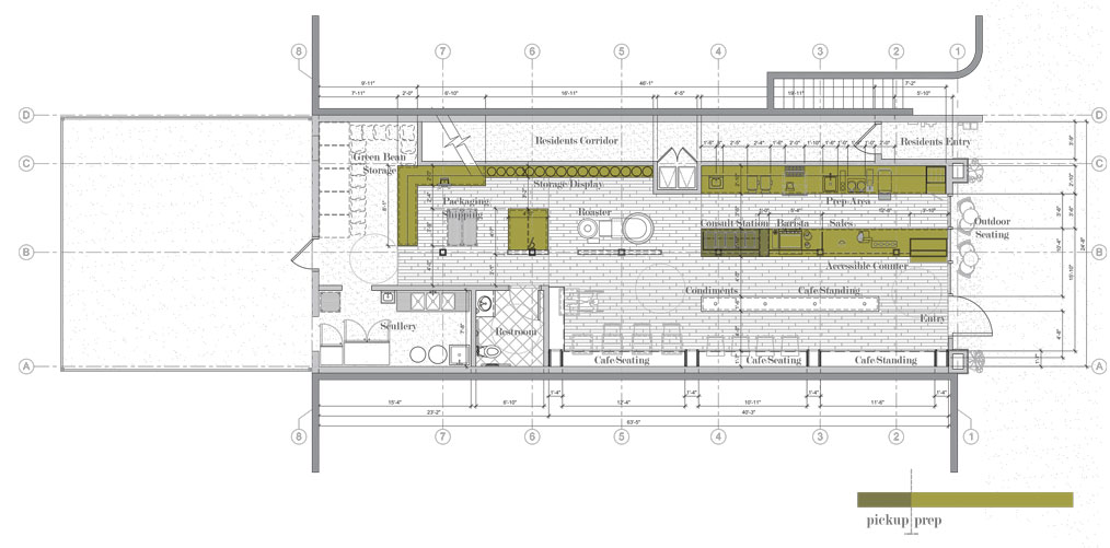
The current space is twenty-one feet wide and sixty-seven feet deep—dimensions the architects opted to embrace rather than try to change. The long, narrow space lends itself well to a process-oriented design. The front-of-house area contains the café elements: the bar and prep area, a roaster’s consult station, customer seating, and retail shelves. The back area contains the packaging and cleaning areas, as well as green coffee storage.
Working with the existing space also meant embracing the large columns running through the café’s middle. To optimize available square-footage, the new layout will flip-flop the existing design. Integrating the bar into the standing columns and moving the seating area to the opposite wall doubles the capacity for guests wishing to enjoy their coffee in house.
To emphasize the space’s dual functionality—as both a roastery and café—it was important that the design highlighted the San Franciscan roaster, as well as the prep and work areas. Opening the customers’ vision line to the centrally placed roaster was what Yemenjian calls a “non-compromisable design driver.”
“When the customer walks in, they see the San Franciscan, they see Henry behind the roaster’s bar—all the way back to Hrag and the staff, packing 200 bags of coffee for a local market,” Yemenjian says. “It’s all visible.”
Expanded seating was also non-compromisable for the designers. A long bench runs along the left-hand wall of the shop, below shelves that will be used to display retail items. Customers will still see what’s available for purchase—as a compromise to the current system, which showcases an extensive inventory, only one of each item will be displayed.
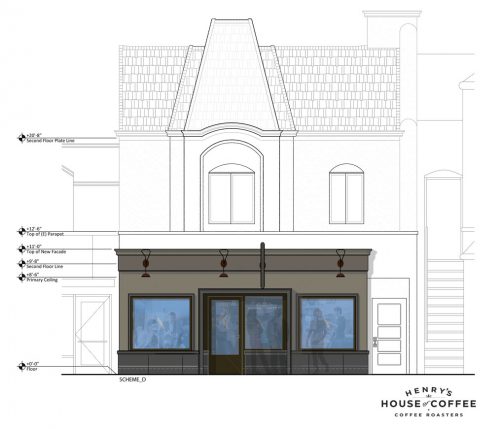
Hrag and Yemenjian refer to the space’s new aesthetic as the “Parent in the Room,” allowing customers to freely explore, with access to coffee expertise as needed. The idea pays homage to the company’s decades-long tradition, while embracing the contemporary climate of the industry. “If you want to get a better sense of your flavor profile preferences and dig into the art of coffee, that’s there as an option, but it’s not beating you over the head,” Yemenjian says.
Hrag hopes placing the roaster’s consult station after the pick-up area will significantly improve customer flow. Currently the shop tends to bottleneck near the entrance, where customers order and retail coffee is housed. When Henry wants to talk to a customer in more detail, he’s forced to lead them against the flow of traffic to reach the retail coffee area. “It gets in the way of one-on-one time with the customer,” Hrag says, who also points out that placing the consult station next to the roaster makes for a more intimate setting.
The new space will be a mix of maple wood, black wood, cement, and light quartz, incorporating the existing color scheme to match the brand’s classic, timeless feel. Hrag says tying in elements of cement and black wood in the midst of light quartz and maple conveys the sense of a roastery without feeling too cold.
Hrag is thrilled to be remodeling the House of Coffee, but offers a piece of advice to shop owners thinking about improving their stores. “If anybody’s ever thinking about doing a construction project—and you want to do it legit—you’ve got to take close to eighteen months in planning,” Hrag says.
Guzman Construction started work on the project in early January. The new design is scheduled for completion by mid-April.
—Ellie Bradley is Fresh Cup‘s editor.
Contemporary Café Build-Outs
Resourceful Café Build-Outs | Irving Farm Coffee Roasters | Spotlight-Stealing Espresso Machines | Go Green | Henry’s House of Coffee


