This post is part of a series on menu development, which examines strategies for building a menu that reflects your brand and engages customers. (Photo: Cynthia Meadors.)
[C]oava didn’t set out to make any sort of statement with their minimalist menu. Their flagship café opened as a tasting room, and the space and menu were designed accordingly. “It was all built around that idea of a tasting menu,” says Jonathon Felix-Lund, director of operations for Coava. “Everything about this space, everything about the menu was about focusing on coffee. Being able to highlight the coffees we put so much time into sourcing and roasting, and we in turn try to highlight the producer as much as possible.”
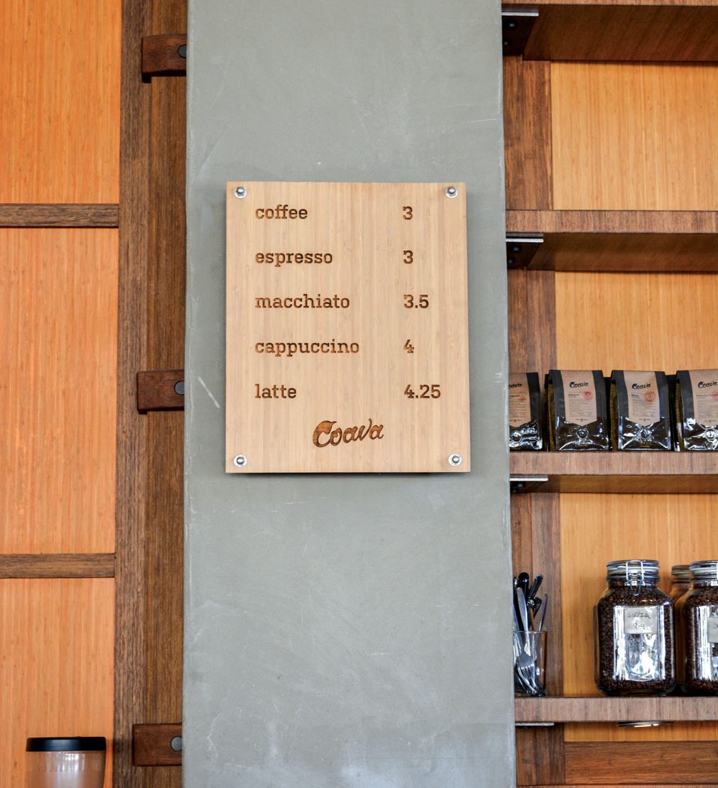
The wooden menu lists the five preparations available at Coava: coffee, espresso, macchiato, cappuccino, and latte. Each day, two roasts are offered for both hand-poured coffee and for espresso-based drinks (displayed on a smaller board on the countertop). Coffees often take names after producers, keeping focus on the coffee and its origins, and encouraging conversation with customers about the bigger story.
Felix-Lund explains that the decision to have only one size of drip coffee (ten ounce) allows for consistency; there’s less to think about when there’s only one cup size for each drink. There’s also less to stock behind bar and in storage, and each milk pitcher can be dedicated to a specific drink type. Condiments and lids are kept behind the bar, enhancing the interaction between staff and customer.
This menu design affords Coava the efficiency and consistency necessary to rotate through a high number of coffees.
–Ellie Bradley is Fresh Cup’s associate editor.
More in this series:


