The explosion in popularity of specialty third-wave coffee, particularly in the 2010s, coincided with the rise of minimalism in contemporary design. Some of the most stunning roaster/café brandings from the last decade typified this trend: think rigid lines, angular geometry, and austere palettes. One friend described the aesthetic as “Kinfolk AF,” referring to a Brooklyn-based lifestyle magazine whose covers are washed in neutral tones and negative space.
In the US, contemporary minimalism’s rise coincided with the aftermath of the Great Recession in 2009. Several self-help blogs advocated decluttering by buying and owning less stuff. One of the most famous faces of such ‘frugal’ minimalism is the Japanese organizing consultant Marie Kondo, who wrote The Life-Changing Magic of Tidying Up in 2010. The book became so popular it inspired a Netflix series on organizing in 2019.
One could initially read third-wave specialty roasters’ embrace of minimalism as a way to declutter and focus on what’s essential (i.e., coffee itself). At its most idealistic, the shift from second wave (think chain coffee shops and oversized couches) to third wave (think single origin coffees and independent cafés) was fueled by a desire to put coffee front and center in a transparent way—remove everything extraneous and the coffee can speak for itself.
Minimalism’s simplicity and austerity made it a fitting style for such an ethos. However, many brands are rallying against minimalist trends, embracing maximalism as an aesthetic with colorful branding and busy and bright designs. Like minimalism did before, this shift gives us a glimpse into emerging ideas and what the future of coffee might hold.
Minimalism and Transparency in Coffee Sourcing
Trish Rothgeb first used the term “third wave coffee” for a piece she wrote for the Roasters Guild newsletter in 2003. “For every outlet that opens with a semi-automatic espresso system, there is a Third Waver,” she writes, “working overtime, staining her hands brown with coffee as she handcrafts the perfect shot.” Essentially, she defined a turning point in coffee where people began paying more attention to where their coffee comes from and the potential to maximize quality in the cup.
With minimalism, retail coffee bag designs became barer and more streamlined. Information about the coffee itself became more prominent. The third wave bag often listed details such as farm/farmer names, processing, and roast dates. Some roasters would resort to using only texts for their retail bags in the same spirit.
But the same simplicity led minimalism to countless iterations with few variations. The news outlet Quartz even went so far as to produce a video asking why many shops worldwide look the same. “Each city had its own version of this generic cafe,” says Kyle Chayka, a design reporter interviewed for the series. Despite the synergy between third-wave ethos and minimalist design, the style’s proliferation threatened the message itself. Repetition turns signal into noise, perfectly summed up by this meme. This is likely familiar to you—most people have probably felt or observed that many cafés make the same stylistic choices.
The Emergence of Maximalism in Coffee
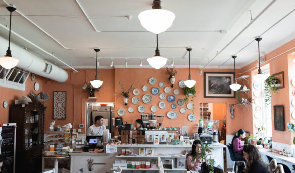
For some, maximalism can be a way to convey a sense of elegance and even opulence. For example, Felix Roasting Company in New York draws inspiration for their café and packaging designs from nineteenth-century British Aestheticism. Aestheticism as a movement lauded the aesthetic value of art, literature, and music over its political or ethical value (“art for art’s sake”).
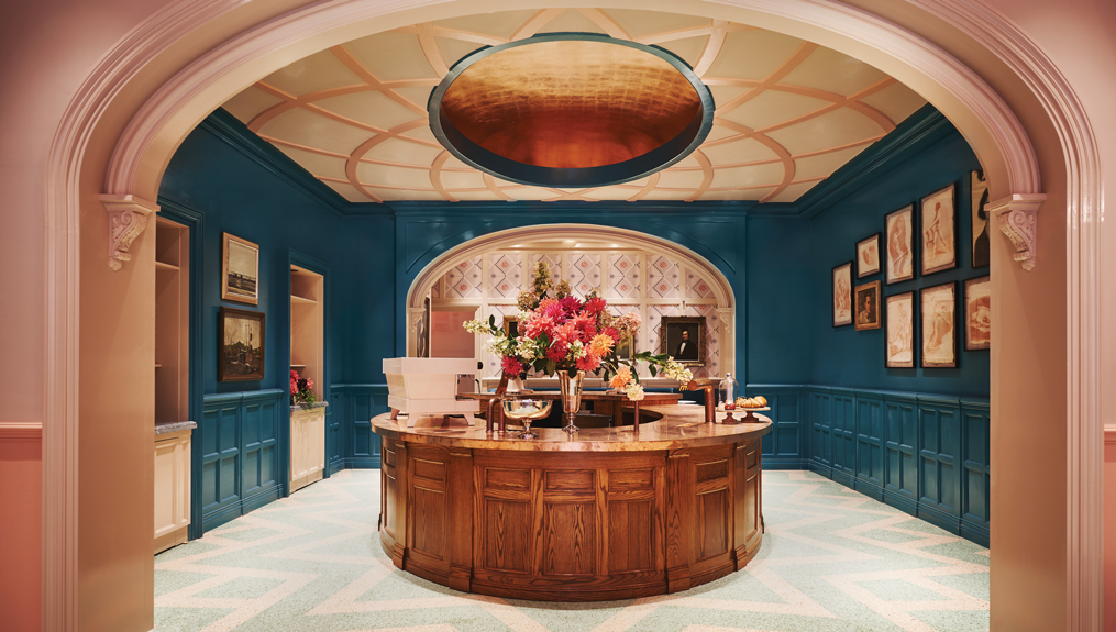
Felix cafés’ interior recalls the gold-leafed Peacock Room by the painter James McNeill Whistler and architect Thomas Jeckyll, an ornate room preserved in the Freer Gallery of Art in Washington, DC. In a Sprudge interview, Felix’s co-founders Matt Moinan and designer Ken Fulk chose Aestheticism conscientiously as a “unique alternative” to the “minimalist trend of the last decade.”
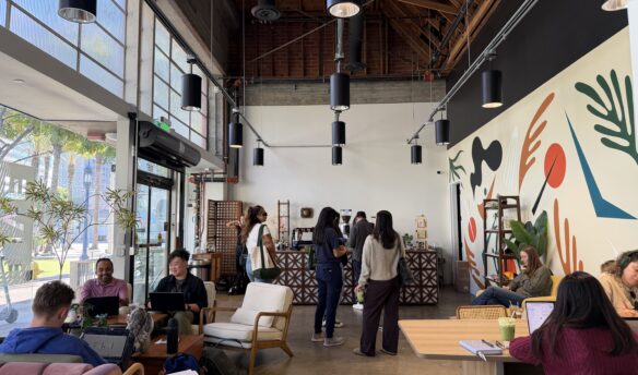
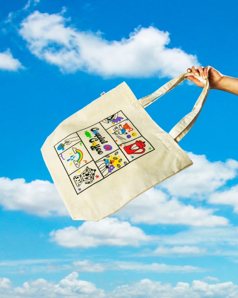
Other brands harness maximalist design to express playfulness and approachability, especially by adopting bright, polychromatic hues. Approachability, in particular, seems to be a key goal for roasters like Couplet Coffee in Los Angeles and Talormade in Oslo, Norway.
Founded by a “first generation immigrant, proud queer woman, and coffee lover,” Gefen Skolnick, Couplet Coffee is very deliberate in being accessible on several levels.
Couplet is not necessarily responding to the pervasiveness of minimalism in specialty coffee branding. But the roastery is aware that the attitude in specialty coffee can be exclusive and “soooo douchey,” according to their website.
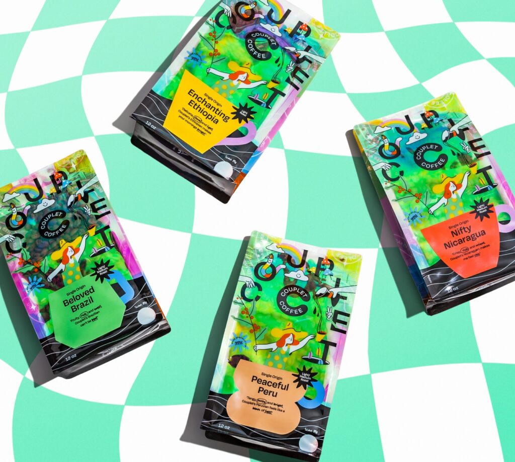
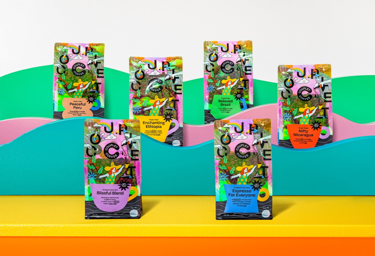
Couplet’s retail bag employs colorful packaging designed by Javier Garcia of Entropia to showcase a playful and queer aesthetic. It is replete with simple, comic strip-like sketches with a woman as a holographic focal point in the middle, holding a coffee tree branch with one hand and a cup of coffee with the other. Notably, Couplet does not list tasting notes on their bags: “We skip the pretentious tasting notes and gatekeeping and get right to the good part – ridiculously delicious coffee you can prepare however the f*ck you like,” their ‘About Us’ page reads.
Approachability Through Branding
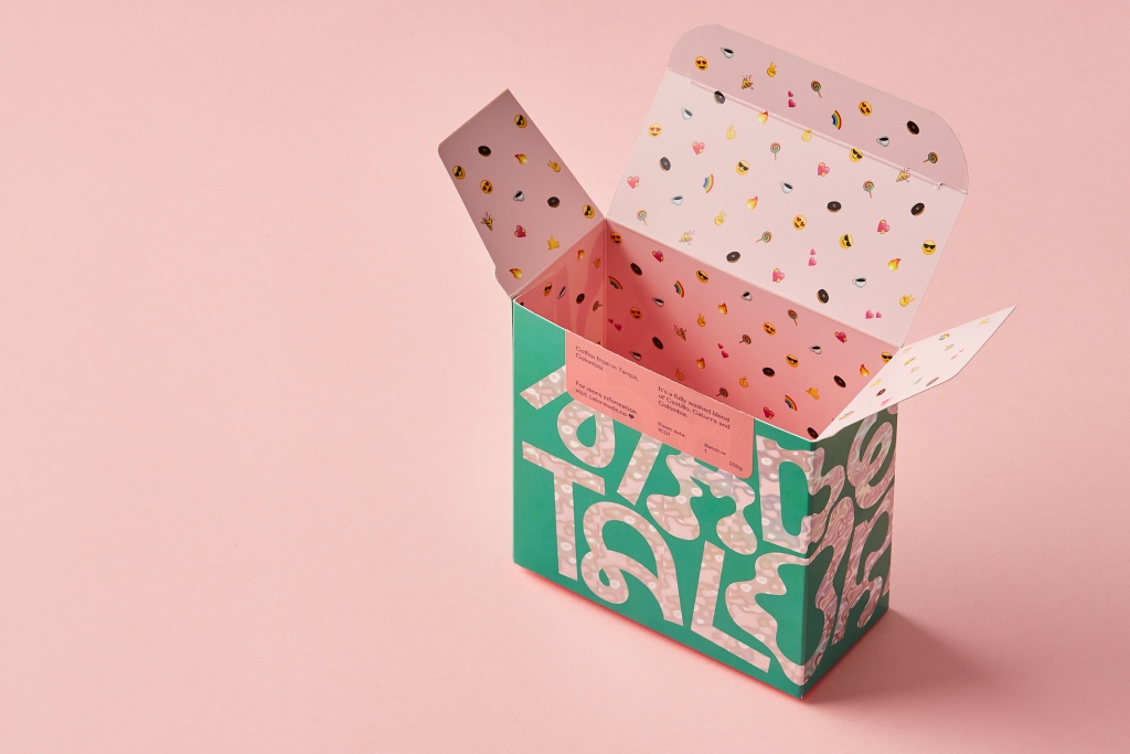
Aussie expat Talor Browne founded Talormade, which is based in Oslo. She is a well-known veteran in the Norwegian coffee scene, thanks partly to her stint as head roaster at Tim Wendelboe.
Like Couplet, making specialty coffee fun and approachable is crucial for Talormade’s mission and branding. Browne feels that specialty coffee can still be friendlier and more welcoming: “Wouldn’t it be nice to have super high-quality coffee but without all the attitude?”
Over a Zoom interview, Browne tells me that specialty coffee has had a problem selling its products because of exclusivity. Talormade’s retail boxes are intentionally fun and playful to entice even people who don’t know coffee. “I wanted people to want [my retail box] even though they don’t know what’s in it.” The coffee’s quality and traceability are still vital to her, but she would instead let the coffee speak for itself.
Browne also consciously incorporates emojis into her branding. Visitors to the roastery’s website are immediately greeted on the upper left with the phrase “Hello friends! ?”
When a customer presses the “order” button on the website, their purchase is celebrated by an explosion of emojis. And the emojis also reappear inside Talormade’s retail box. In a way, this is a continuation of the customer’s experience from the website. Browne also imagines the customer finding the emojis inside the box akin to a child opening a “Kinder Surprise,” a play on a popular chocolate candy shaped like an egg with a small toy in the middle: the coffee is the treat, while the inside emojis are the surprise.
For Browne, a playful and beautiful branding is a more viable path to selling more specialty coffee, not educating customers on specialty coffee. For her, the ideal for specialty coffee is “not to be a niche anymore. We want to change the way consumers buy coffee… we’re not going to do that by educating them. They’re [specialty coffee roasters] only going to do that by making it easy and accessible and beautiful.”
What’s Old Is New Again
Maximalist design is far from new. Felix derives its branding from a tradition that later evolved into the French Decadence movement. Couplet and Talormade, on the other hand, draw from pop culture to make specialty coffee more accessible to the larger public. Read against minimalism, however, maximalism is still exciting since it has not been standardized the way minimalism has in coffee.
If the ethos of earlier third-wave coffee is transparency, an essential ethos of the current specialty scene is perhaps accessibility (and, by extension, inclusivity). Roasters like Couplet and Talormade prove that maximalism can be a means for the current coffee scene to be more relatable. For them, fun branding is a key to introducing specialty coffee to more customers.
As in natural wine labeling, embracing a more irreverent and playful packaging in third-wave coffee is one way to make a product usually associated with exclusivity and high cultural capital more casual and inviting. The shift from minimalist to maximalist aesthetics symbolizes the changes in coffee and will hopefully invite more people to join the party.
Mikey Rinaldo (they/them) is the roaster/founder of New Math Coffee, a Chicago-based roastery focusing on specialty Asian producers.